
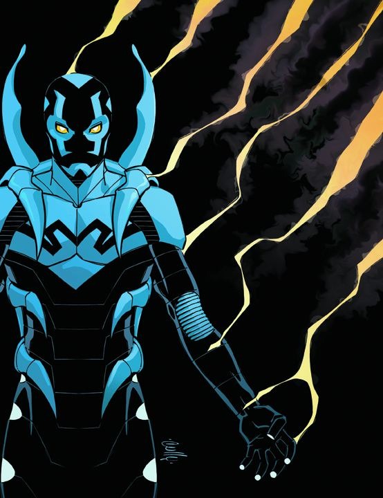
 Seen the new Blue Beetle? I kind of like the costume, and I think Keith Giffen and Cully Hamner will probably give us a really interesting series. I've never really heard of Hamner before, but from this picture I get a little Tony Harris or Phil Hester vibe. Very sharp lines and good use of color. I do have a few problems with it though.
First, this new costume violates the Ron Frenz Rule of Costume Design. I'm not a Frenz fan anyway, but I find the rule hilarious and useful. Uselarious, if you will.
 Cully Hamner may have the design down, but as soon as he's gone from the book, the costume will either change, or will become horribly inconsistent. There's a lot of little designs to keep track of, particularly on the mask.
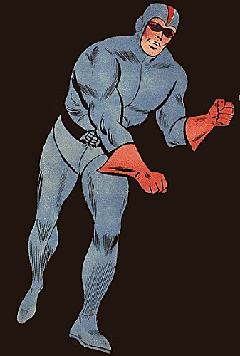
 I'll grant that this is a big step up from Dan Garrett's costume. Dan Garrett wore little more than a blue jumpsuit with red gloves. And a skullcap. He wasn't the most distinctive-looking character, and I'm more than a little glad that he hasn't done much in the last several decades.
 But Ted Kord? Damn, that's a good costume. That's an "if it ain't broke" costume.
 See, I'm going to start with the assumption that Steve Ditko designed the Spider-Man costume, and that it wasn't cover artist Jack Kirby. Starting from that assumption, we see that Ditko, among other things, was a damn good costume designer. He understood how to make costumes that were simple, made good use of color, and still stood out and felt timeless. Dr. Strange? Timeless. Spider-Man? Timeless. Ted Kord looks as good now as he did forty years ago.
Well, ignoring the big hole in his head, anyway.
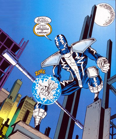 I don't see this costume being that sort of timeless icon. I see it looking a little too much like 90s Spider-Man villain Cardiac. Change the white to black and replace the giant Liefeld shoulder pads with a beetle-esque backpack, and you've got something like Hamner's beetle.
 Finally, what's with all the black? Isn't OYL a move away from all "dark 'n' gritty" comics? I suppose if he's going to be caught up in all the crazy magic stuff that the Shadowpact will be dealing with, a little darkness (or a lot) would fit the tone of the book, but I think most people think of the Blue Beetle as a happy-go-lucky jokester. This guy, if he were smiling, you'd never know.
Of course, it also looks a little like the Kingdom Come design for Blue Beetle. With Nabu taking over the Fate garments, it appears that we're moving toward the KC future designs again. I wish we'd stop that, I thought that trend was over years ago.
2 comments:
I'm more disappointed that the character's obviously male than the costume beign too ornately designed. I was kind of hoping for a female Beetle to play off Booster this time around. I guess they wanted the buddy team dynamic without the romantic tension.
Also, he looks like Spawn. That doesn't bode well for any character, except Spawn.
Cully Hamner illustrated the wonderful Green Lantern: Mosaic series back in the 80s. I suggest you track down some back issues and read them. Chock full of philosophical wierdness, and without a doubt the strongest portrayal of John Stewart since his creation.
Hamner also did Red with Warren Ellis. Kinda reminds me of Dave Johnson, for some reason.
Ditko designed Electro, and for that, I am eternally grateful.
Oh, and I kinda like that Beetle outfit. It's certainly going to look like Hell outside that book, though, you're right. Remember how much trouble Howard Porter had with Kyle's stupid crab mask? Lordy.
Post a Comment